Stretch App
2020Brief
This was a portfolio piece aimed at practicing design on mobile devices. The idea for the app was to provide succinct and targeted stretching routines that would provide relief from injuries or pain.
Solution
The app contained listings of physiotherapy programs that detail the exercises you need to complete, with additional information like timing and frequency.
UX Design, Development, Product Strategy
Figma
Project Images
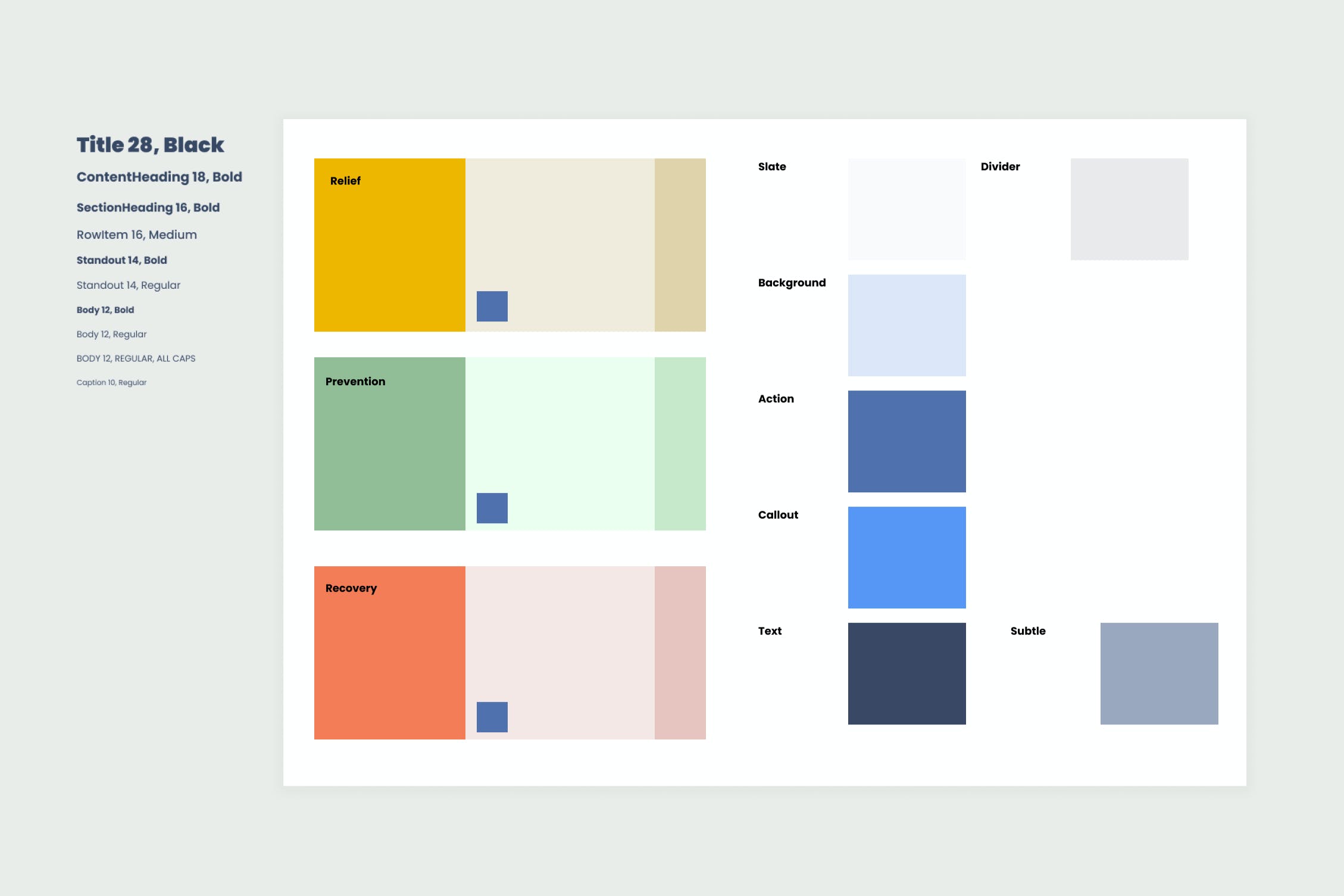
Developed a colour palette and typography system for use throughout the app.
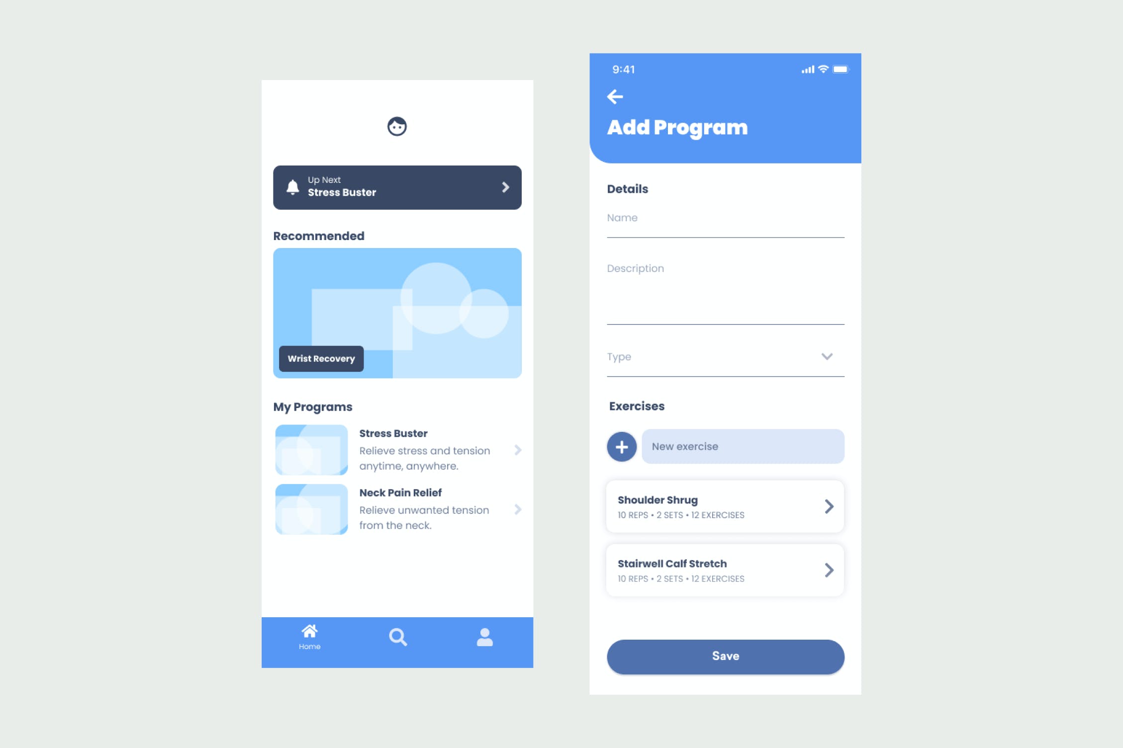
The homepage highlights key items that would be useful to the user. This includes notifications of scheduled programs, recommendations for other programs that might be of interest, and quick access to their saved programs. Users also have the ability to create programs; the screen on the right shows how a user can quickly build a list of exercises.
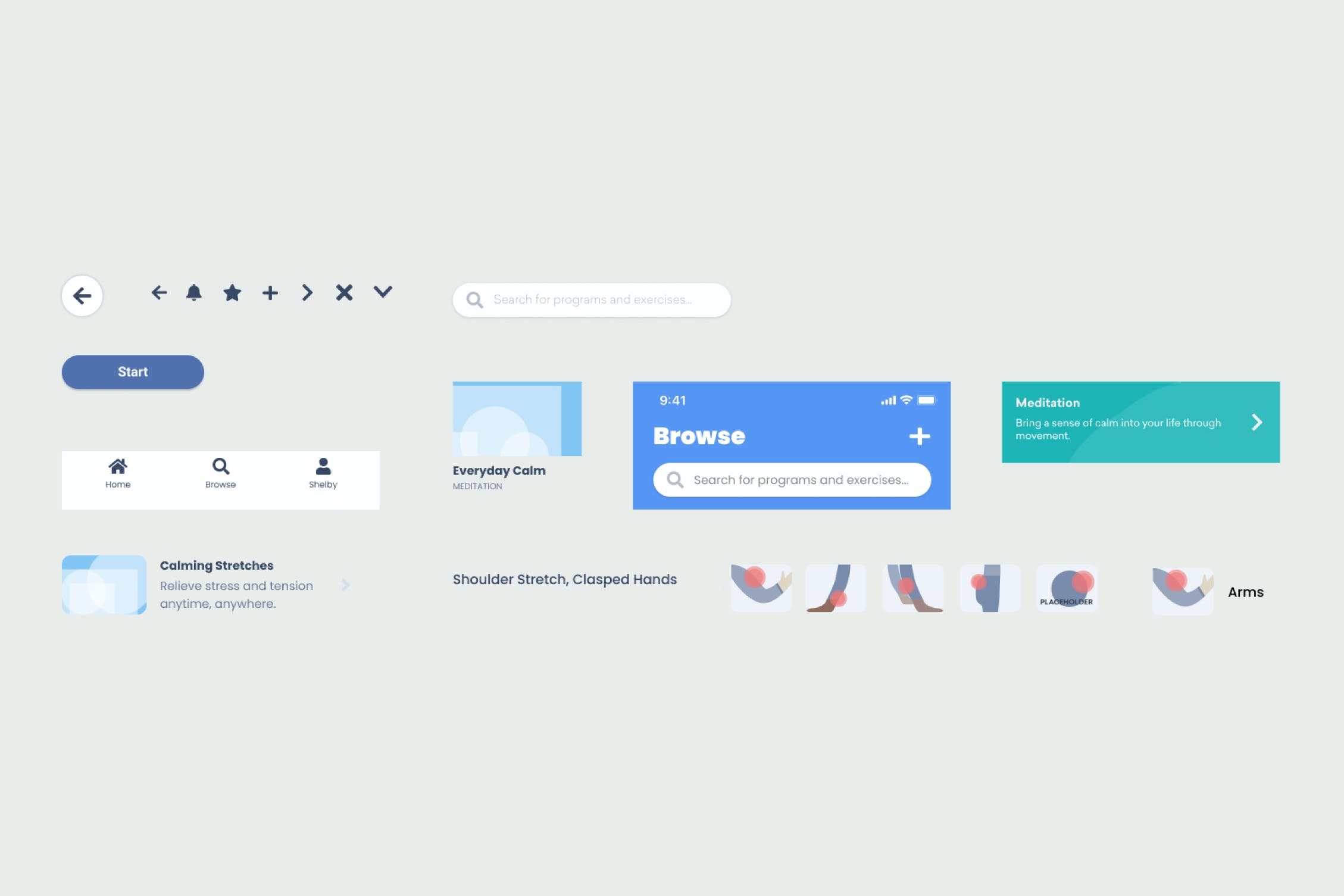
This is a sample of components used throughout the app. These capture some of the repeatable elements that can be customized with font styles, colour, and iconography.
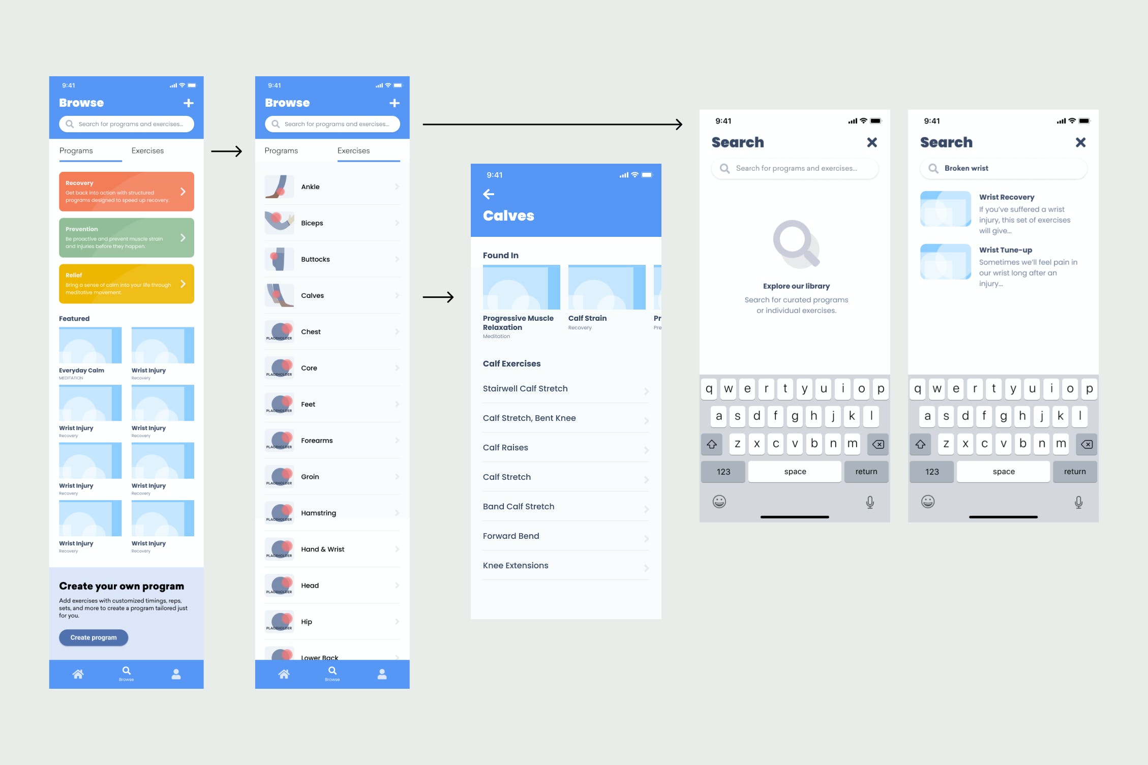
The app breaks down content by program & exercises. Programs can be of type recovery, prevention, and relief. They can contain many exercises and maintain a reciprocal relationship with programs, as seen in the "Found in" section. The UI takes advantage of lists and grid elements to neatly display information and makes it easy to parse through large amounts of content.
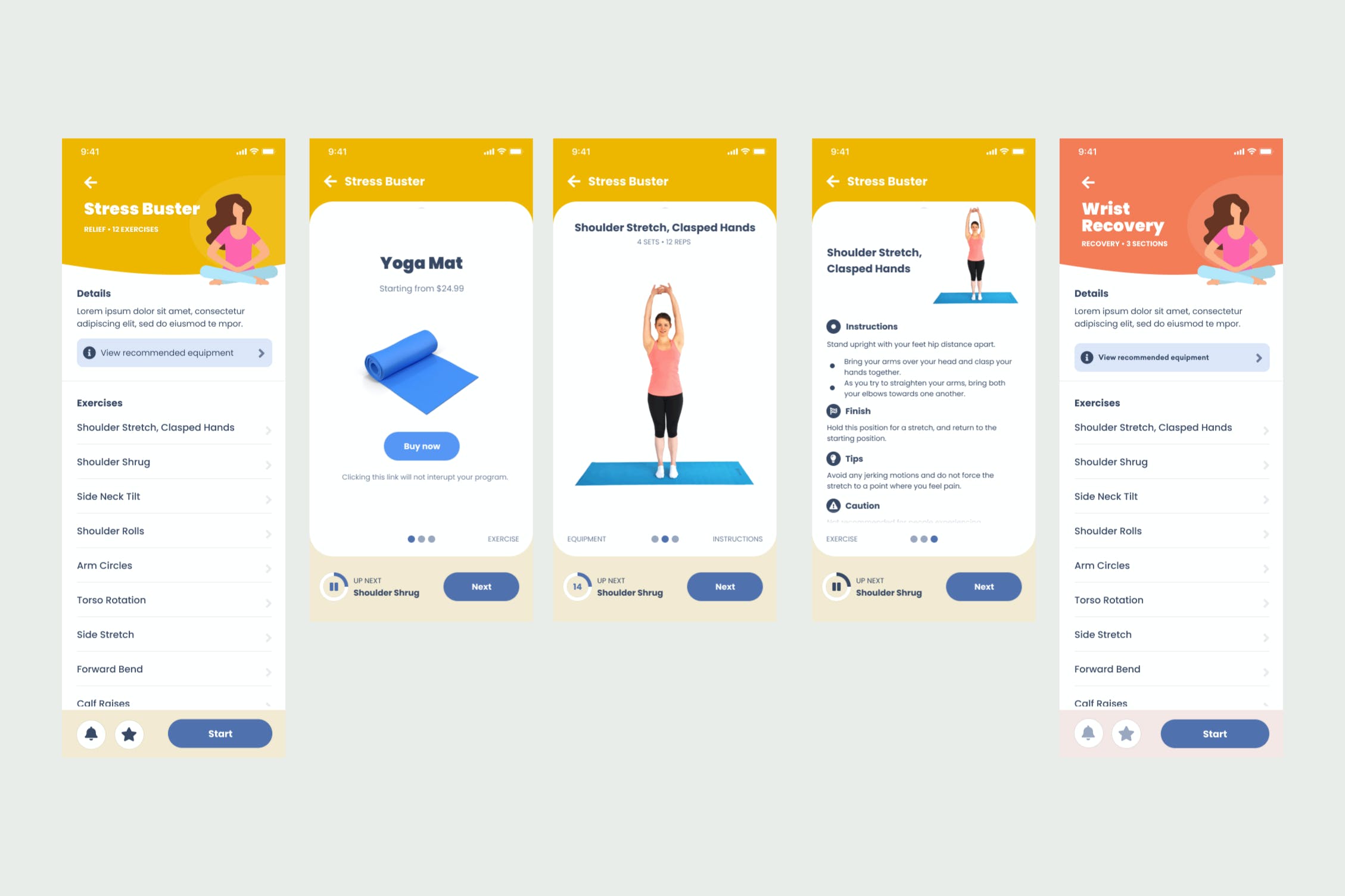
The program screen gives users a preview of the exercises they will be doing and a brief description. Once into a program, the interface places importance on the exercise while offering instructions and equipment as supplementary information. The goal of the design was to combine a graphically appealing interface with clear and concise information for the user. Getting into their exercise as fast as possible and getting relief.


